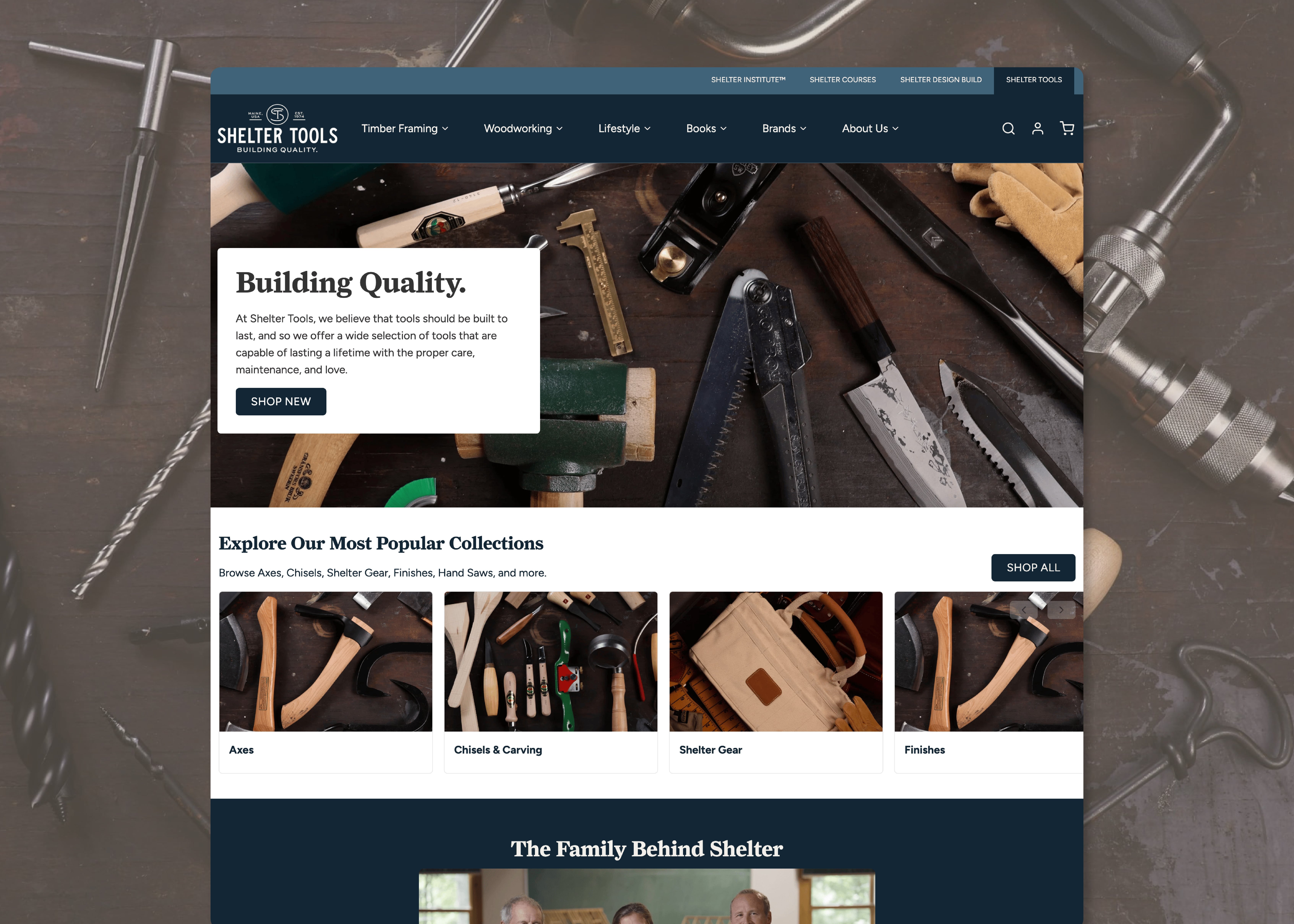
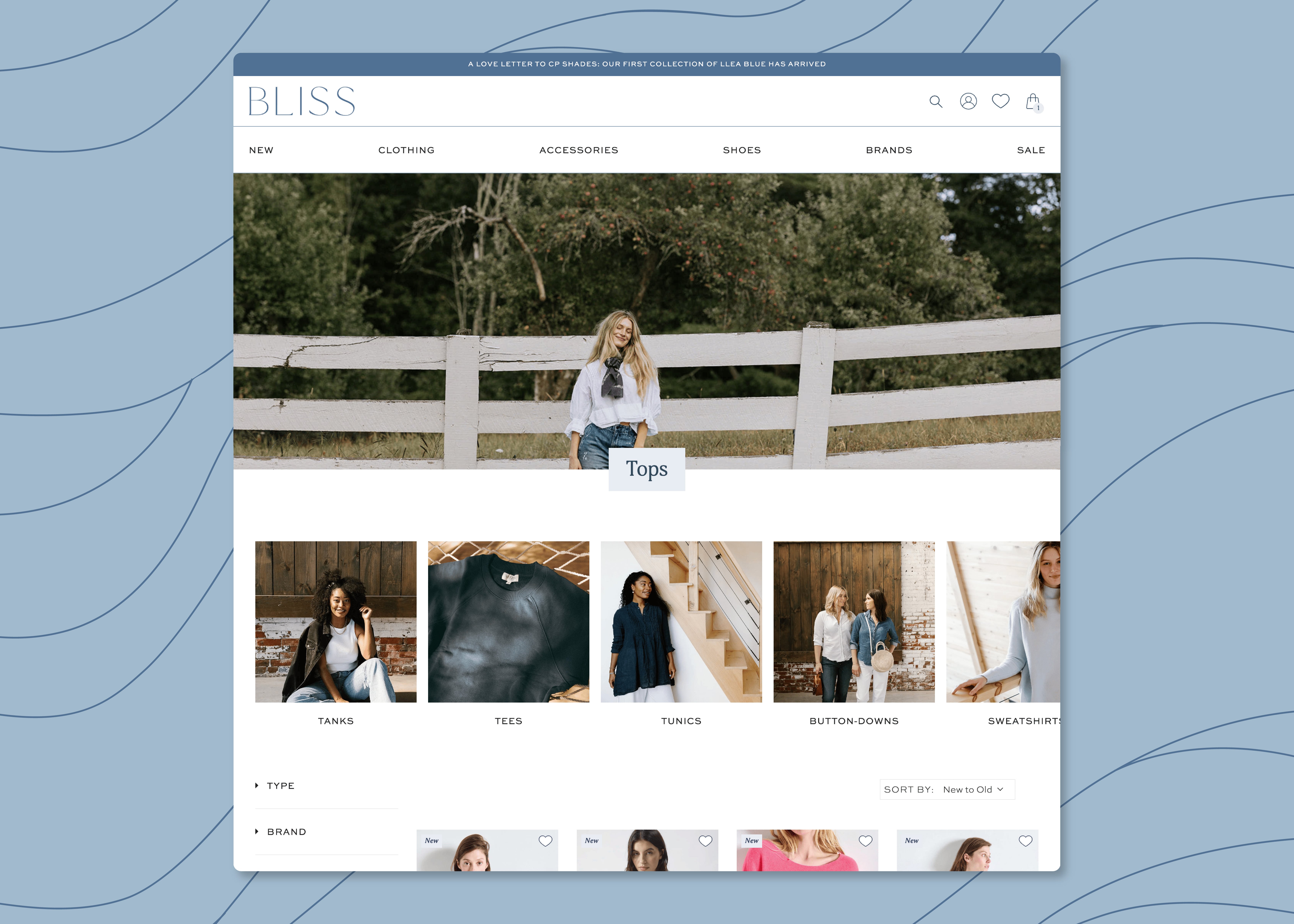
Here's the thing–we design websites, landing pages, and web components pretty much all day, every day. We do a lot of website work, right? And while it starts with strategy (always start with strategy), it typically moves swiftly into design, and we get it done!
But (and it's a big but), every unit of UX design–all the sites, the landing pages, the new sections, the user interactions, the journey mapping, the wayfinding, the navigation, the filtering– is designed for a purpose. We design to improve conversion rates, overhaul complicated navigation (which also improves conversion rates), or give a site with good content a much-needed glow-up (which might, yeah, also improve conversion). Why do we spend time doing this? To better communicate brand values and quality, which we believe will improve conversion.
The point of all this design, which turns into all this execution, is to create beautiful, clear, and smart ways for customers to do what we (and you) want them to do: buy things.
We take great pleasure and pride in doing good design work and using it to build beautiful and performant websites. Sure, it's a bit like being really proud of the potatoes we use to make fries, but have you tried making fries with moldy potatoes?
We are passionate about best practices in current ecommerce design because spending time and effort on designing performant, progressive, and propulsive web experiences turns into conversions. And as you know because you're here, conversions turn into revenue, and revenue turns into growth and that is what we're ultimately designing towards.









.png)
.png)
